
A stock market heat map serves as a vivid and intuitive tool for investors, traders, and financial analysts alike. These dynamic visualizations quickly distill complex market data by representing stock performance through color-coded graphics, allowing users to interpret the direction and magnitude of market movements instantly. With the sheer size and velocity of today’s markets, heat maps have become essential not just for professionals on Wall Street, but also for retail investors and anyone seeking market clarity in real time.
How Stock Market Heat Maps Work
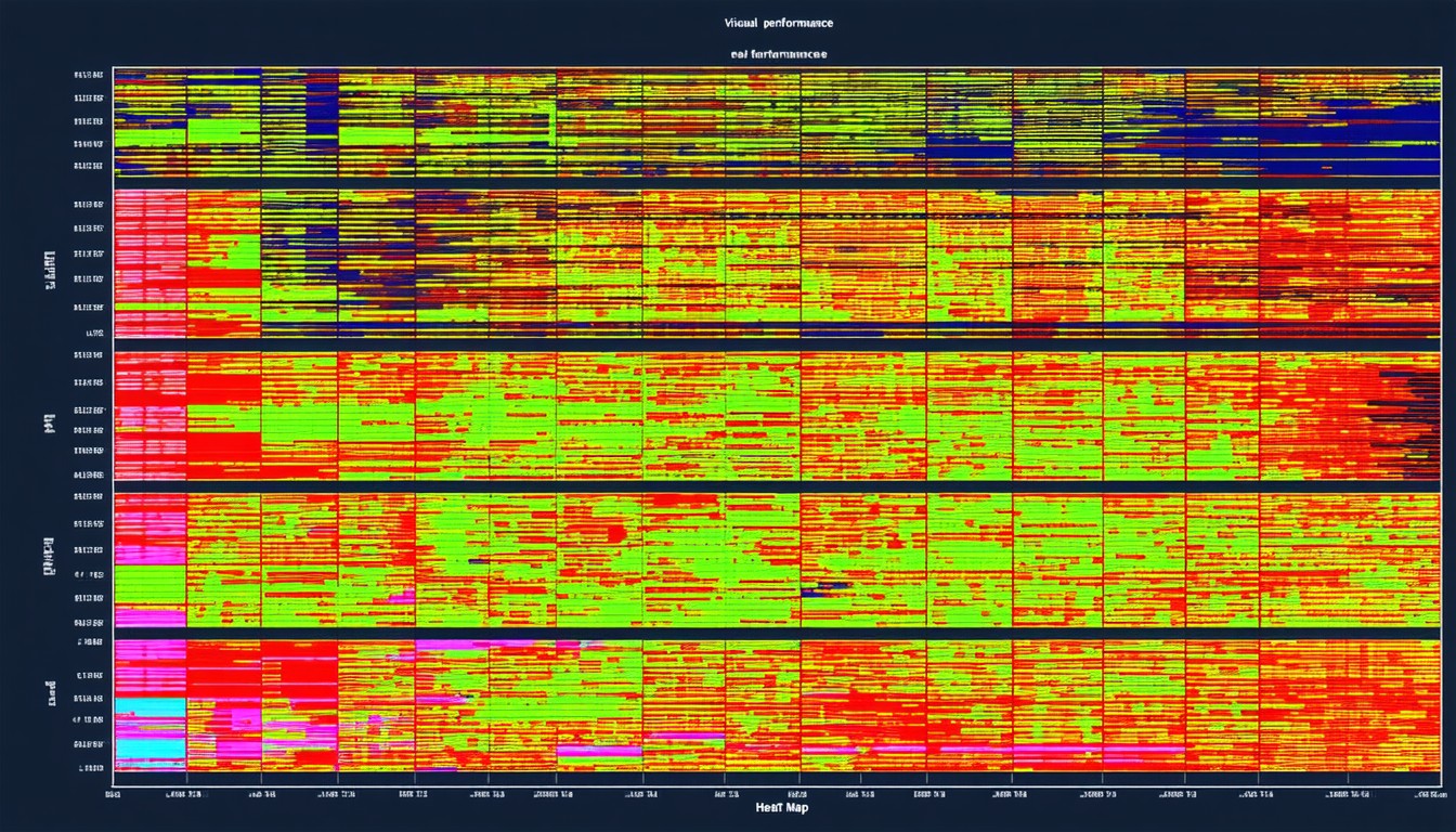
Heat maps in the context of equity markets are graphical representations, often structured as a grid, in which each tile or rectangle corresponds to a different stock or financial asset. Colors—typically shades of green and red—signal whether securities are trending up or down and by how much.
The Key Elements of a Stock Market Heat Map
- Color Coding: The primary method for conveying stock movement; green generally denotes gains, red indicates losses, and varying shades reflect the magnitude.
- Size of Tiles: Frequently, the size represents the market capitalization, so dominant companies such as Apple or Microsoft have larger tiles.
- Groups and Sectors: Stocks are usually organized by sector, helping users compare performance within and across industries at a glance.
- Interactivity: Modern heat maps are interactive, offering real-time updates, tooltips, and even links to in-depth company profiles.
This immediate visual context can illuminate patterns that might otherwise go unnoticed in rows of numbers and ticker symbols.
The Rise of Real-Time Visualization in Financial Markets
With financial data becoming increasingly accessible, the need for digestible, real-time analytical tools has surged. Throughout the past decade, market heat maps have transitioned from specialized trading software into mainstream use, featured on platforms like Finviz, Yahoo Finance, and TradingView.
“Visual data tools like heat maps have democratized how both professionals and everyday investors digest market movements, making actionable insights available within seconds,” observes Priya Menon, a portfolio manager at a leading investment firm.
During periods of high volatility—such as the 2020 market shock in response to the coronavirus pandemic—heat maps proved particularly valuable. Investors could immediately spot sector-wide sell-offs or rallies, refine their risk management strategies, and identify potential outliers. Such visualizations now underpin everything from rapid portfolio reviews to strategic asset allocation.
Interpreting and Using Stock Market Heat Maps Effectively
While heat maps are visually straightforward, truly leveraging their value requires context and critical thinking.
Key Use Cases for Investors and Analysts
- Sector Rotation Strategies: By identifying which groups are gaining or lagging, asset managers can adjust portfolios to ride sector momentum or hedge underperformers.
- Market Sentiment Analysis: Extreme concentrations of red or green across the map can signal oversold or overbought conditions, prompting contrarian strategies or caution.
- Stock Comparison: Investors can quickly spot which companies in a sector are outpacing peers, helping with stock selection for short-term trading or long-term investment.
- Volume and Volatility Tracking: Some advanced heat maps include overlays for trading volume or volatility, offering deeper context for price changes.
Limitations and Pitfalls
Despite their utility, heat maps present only a snapshot—and can oversimplify or miss nuances, especially during periods of low liquidity or for small-cap stocks that may not capture major headlines. Color gradients can also sometimes exaggerate the severity of moves, so users should always complement heat map analysis with traditional financial research.
Popular Examples and Platforms
Several platforms have popularized and refined the stock market heat map experience:
Finviz Heat Map
Arguably one of the most widely used public heat maps, Finviz offers a comprehensive overview of the U.S. equity market. Its interface is customizable by index, market cap, and can overlay metrics such as P/E ratios or dividend yield.
TradingView and Yahoo Finance
TradingView’s customizable heat map integrates with sophisticated charting tools, allowing users to filter by exchange or timeframe. Meanwhile, Yahoo Finance presents a more accessible option for retail investors, with clickable tiles that link to rich company data and news.
Institutional Solutions
Bloomberg Terminal and FactSet include advanced heat mapping for institutional clients, supporting everything from real-time trading to detailed portfolio risk analysis.
These resources demonstrate the heat map’s place at the intersection of technology and active market insight.
Best Practices: Integrating Heat Maps Into a Broader Investment Process
While heat maps are powerful, savvy investors treat them as one component of a broader analytical toolkit. Used in isolation, they risk reinforcing surface-level trends or short-term thinking. Instead, best-in-class investment strategies use heat maps in four main ways:
- Screening: To identify outliers or leaders in market performance for deeper fundamental or technical analysis.
- Monitoring: For daily portfolio checkups, to track exposure to sectors, winners, and laggards.
- Strategic Shifts: To support tactical asset allocation, particularly in fast-changing market environments.
- Communication: For fund managers to present performance snapshots to clients or stakeholders succinctly.
A robust approach blends these visual insights with earnings data, macroeconomic context, and broader market sentiment.
The Future Evolution of Market Visualization
Technological innovation continues to refine the real-time visualization experience. Integration of AI-driven analytics, more granular filtering, and even augmented reality overlays are on the horizon for the most advanced trading desks.
Additionally, as alternative asset classes—such as cryptocurrencies and ESG-focused equities—gain prominence, heat maps are evolving to cover a broader universe, with more advanced categorization, like environmental impact or governance scores.
These developments promise to keep heat maps at the forefront of financial analytics, helping market participants respond nimbly to an increasingly complex investment landscape.
Conclusion
Stock market heat maps have transformed how investors, analysts, and traders process complex market data. By translating price movements, volumes, and sector dynamics into easy-to-interpret visuals, they empower more informed, timely decisions—though their best use comes when paired with deeper fundamental and technical research. As data, technology, and market access continue to expand, heat maps will remain a cornerstone for anyone seeking to navigate, interpret, and outperform the evolving world of equities.
FAQs
What is a stock market heat map?
A stock market heat map is a visual tool displaying the real-time price performance of stocks, using colors and sizes to reflect price changes and company significance. They help users quickly assess market sentiment and sector performance.
Are heat maps updated in real time?
Most popular heat maps on leading finance platforms refresh every few seconds or minutes, providing near real-time market snapshots. Institutional platforms may offer even faster, tick-by-tick updates.
How should I use a heat map when making investment decisions?
Heat maps are best used to spot trends or outliers, but should always be combined with additional research into company fundamentals, news, and macroeconomics before taking action.
Can heat maps help with day trading?
Yes, heat maps can give day traders a quick overview of which sectors or stocks are moving the most, aiding in finding opportunities—but they’re only a first step for in-depth strategy.
Are there risks in relying solely on heat maps?
Relying only on heat maps can lead to superficial decisions, as they may exaggerate short-term moves and don’t provide underlying reasons for price changes. Always use them with other analytic methods.
Which platforms offer the best stock market heat maps?
Popular options include Finviz, TradingView, and Yahoo Finance for retail investors, while Bloomberg and FactSet cater to institutional needs with more advanced features.


Leave a comment